This is the multi-page printable view of this section. Click here to print.
Fonts
1 - Types and usage
Features of the Latin script that continue to shape how we communicate in print go back to the century that followed the invention of movable type in Europe and even further to ancient Rome.
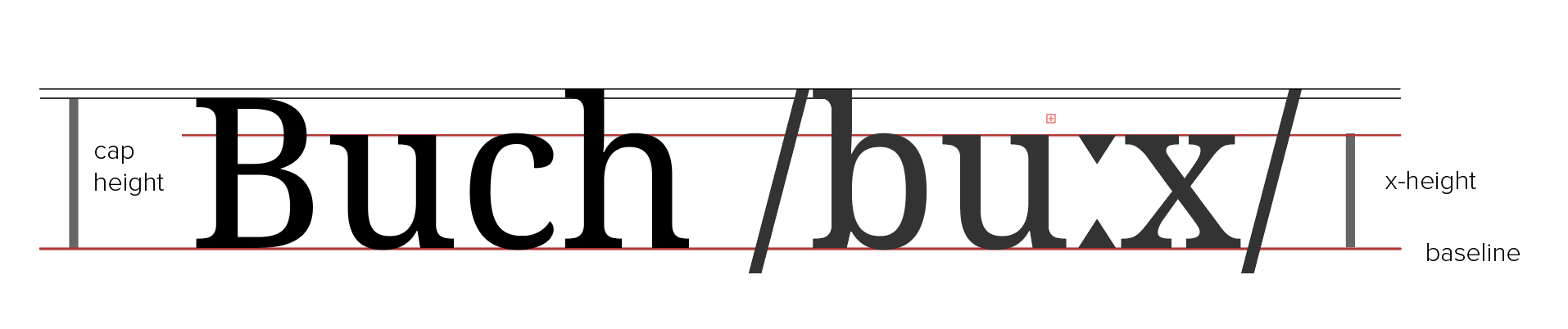
The profile of a font
One of these ancient features is the presence of serifs, or projections at the extremes of certain strokes, as in the upper case e and in x here.
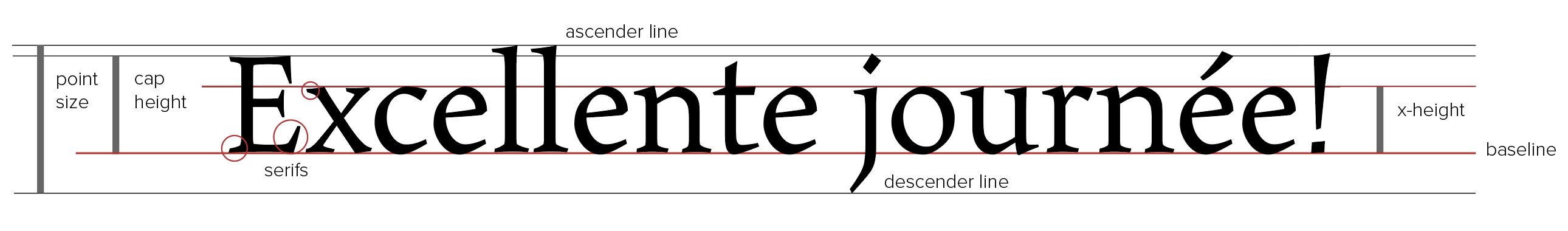
Profile of a serif font (right click to view full size)
Each font has a number of distinctive elements, notably its x-height, or the height of lower-case characters, and its capital height. The full point size of a digital font is the distance between its descender and ascender lines (typography, needless to say, has its own distinctive terminology).
A font’s x-height has an important bearing on its legibility.
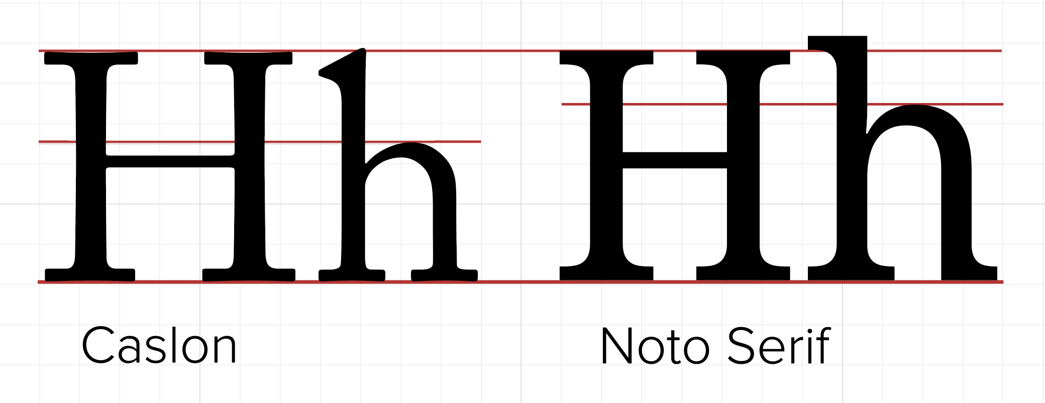
Contrasting x-heights
Fonts of quite similar point size can have x-heights that differ quite sharply. The raised x-height of Noto Serif means that it is more legible at smaller point sizes, provided that inter-line spacing is slightly increased.
Serif and sans serif
Many features of the design of serif fonts derive from calligraphy. Sans serif fonts, by contrast, are more geometric and less ornamental in character.
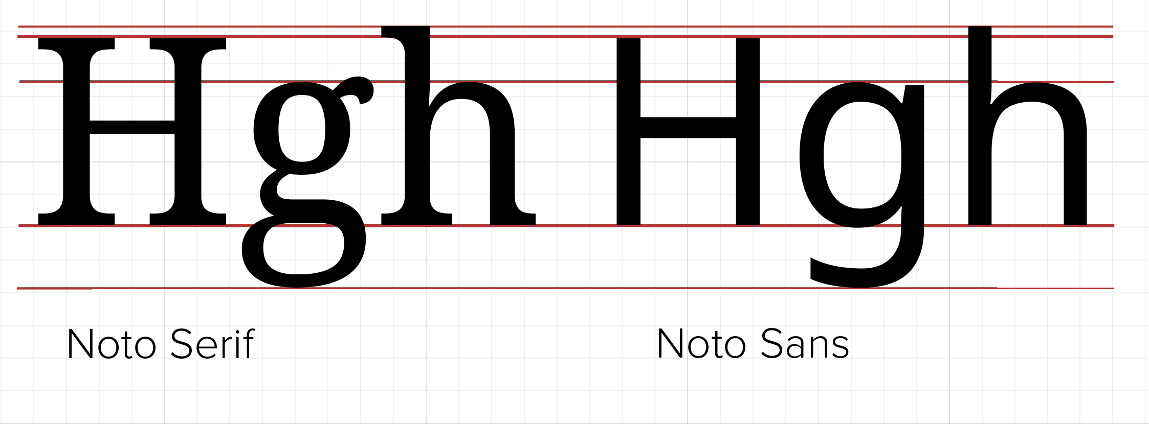
Serif and sans serif
Even so, some sans serif fonts retain the contrast between thinner and thicker elements of a character: compare the shoulder of the letter h in the two forms of the Noto font, or the counter of the sans serif g. Note also that in the serif and sans serif forms of Noto the x-height, capital height, ascender and descender lines are identical. Today, many fonts exist in the form of font families encompassing serif and sans serif forms with many variants of style and weight. Noto Sans is the font used in this site.
Styles and weights
Italic fonts were first used in the sixteenth century to print material in Latin.
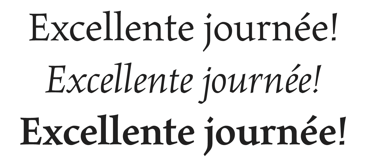
Styles and weights: roman, italic and bold
Nowadays, they are used for more specialized purposes, e.g. to emphasize individual words (especially in serif fonts) and to denote the titles of books and other full-length works, e.g. Le città invisibili, Le Mariage de Figaro. Word-processors sometimes present block quotations by default in italics, but this is not a style that you should follow in your essays; likewise, italics should not be used for inline quotations.
Bold fonts can also be used for emphasis and also to highlight the structural hierarchy of elements of a document, e.g. in headings. Note that here all three typefaces have the same point size, but differ in width.
OpenType fonts
OpenType is the most widely available font format available today. This is a file format that allows several different font variants to be combined in a single file — extending to features that we will now consider, including small capitals, ligatures and various forms of numerals.
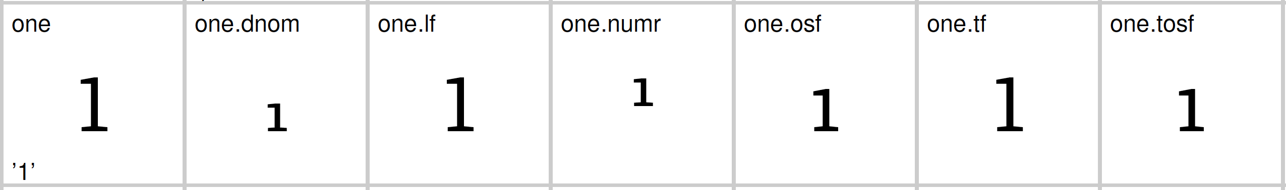
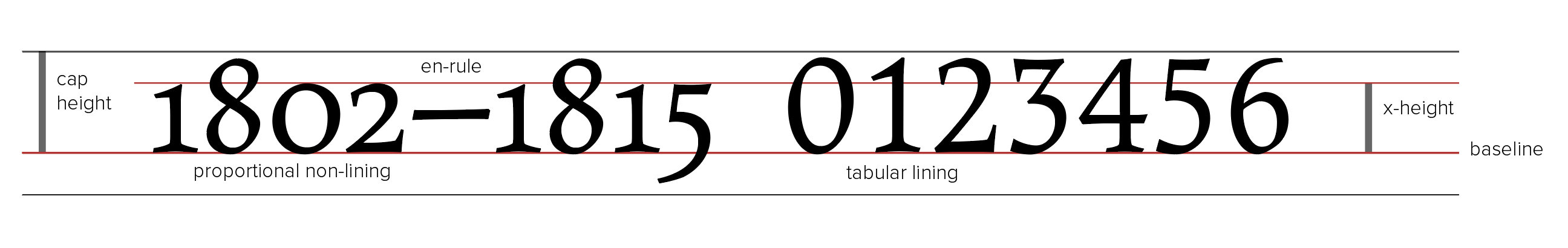
Variations on the number 1
Here are the several forms of the number 1 in the font Faustina, including forms used in fractions, lining and non-lining versions with tabular and proportional variations. It is possible to activate any OpenType forms you wish to use in a document using controls in a word-processor.
Small capitals and structural divisions
Small capitals, which are characters that take the form of capitals but are proportional in height and weight to lower-case characters, emerged also in the sixteenth-century, typically to designate headings or other structural elements.
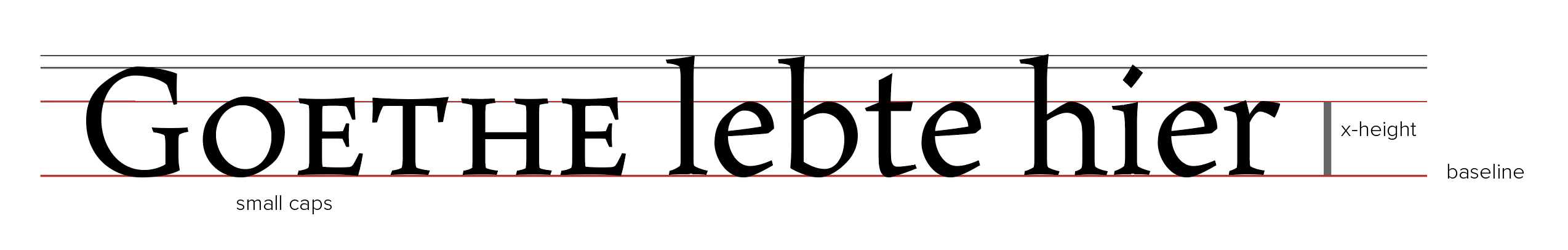
Small caps
As you can see here, they are marginally taller than the font’s x-height.
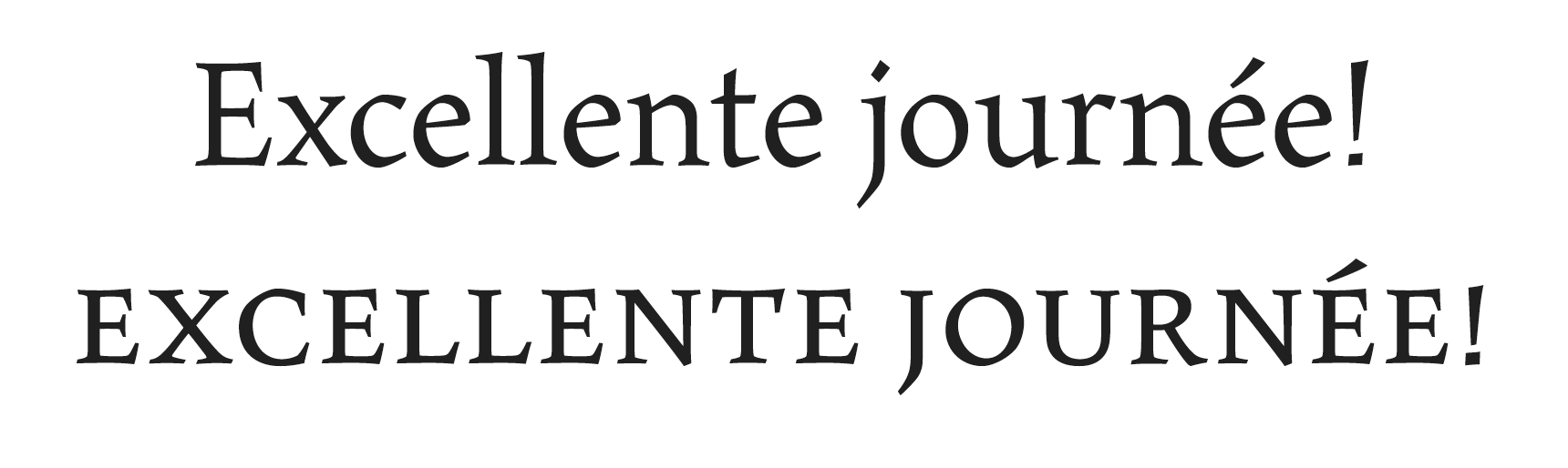
Roman and small caps
An unbroken series, as here, without any upper case characters is referred to as even small capitals and is a form often used in headings, and in page headers and footers. Note that this font also incorporates a form of the exclamation mark that is in proportion with the small capitals.
The legibility of small caps demands that what is termed the line’s tracking, in other words, the space between characters, is increased: hence the greater width of the second line.
Kerning
Even where the tracking in a given font may have been varied, some upper-case characters call for further adjustments. This form of adjustment is called kerning.
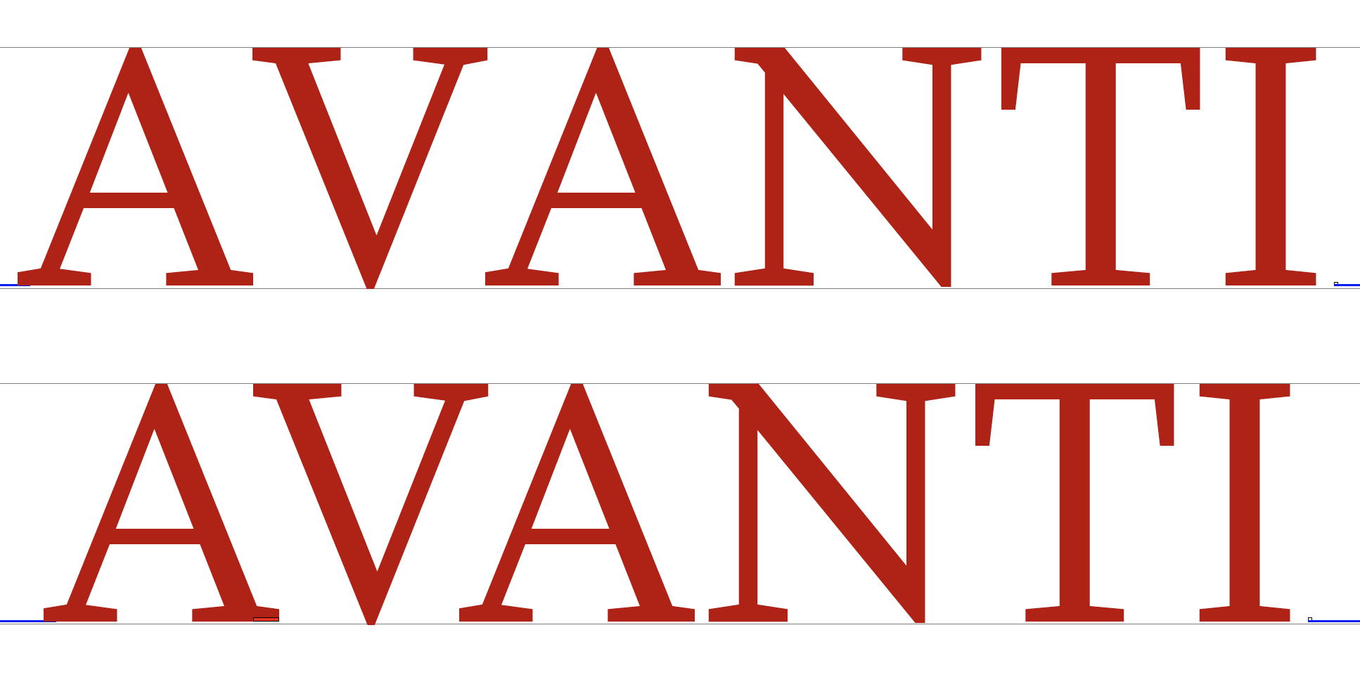
Top line: no kerning
You can see here that the spacing between the first three characters in the top line looks out of proportion with the rest.
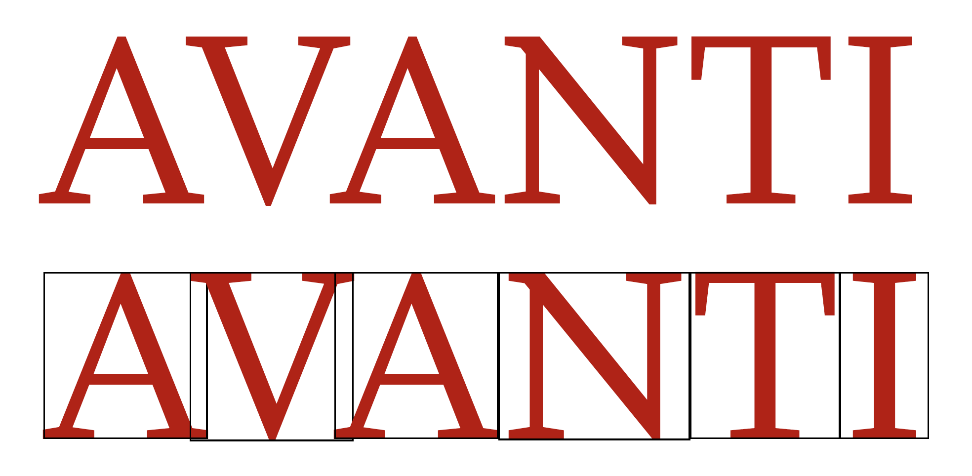
Kerning applied
Here is the second of the two lines with each character enclosed within a bounding box. Kerning is a special form of adjustment between specific upper case characters in particular. As you can see, when kerning is applied the a and the v all notably overlap, making the string as a whole appear more evenly spaced.
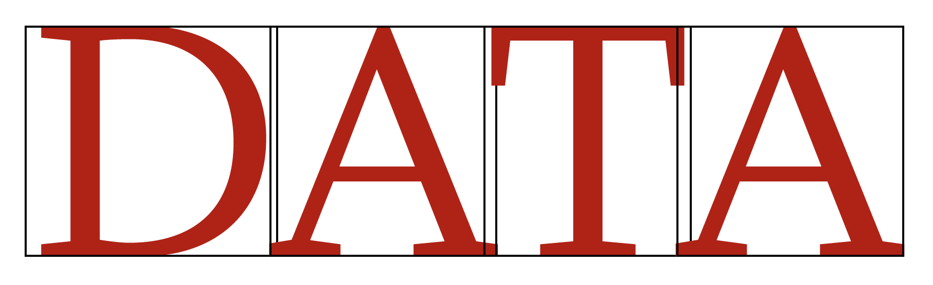
Variable kerning
In some cases, several characters in a row will require kerning, though to different degrees according to the specific combinations that may arise.
Digraphs and ligatures
In some scripts, a single printed character can be composed of two components. This feature is termed a digraph: here is an example of a character that represents a discrete diphthong in Dutch and belongs to the Latin Extended-A block in Unicode.

IJ in Dutch: upper and lower case
In other words, this character is different from i and j printed side by side, which is why it has its own Unicode code point.
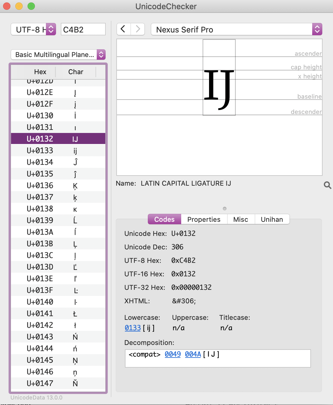
IJ: a composed character in Unicode
Another example is the character Dž and its lower-case equivalent dž, which are used in Croatian script. A further variant is the double capital form.
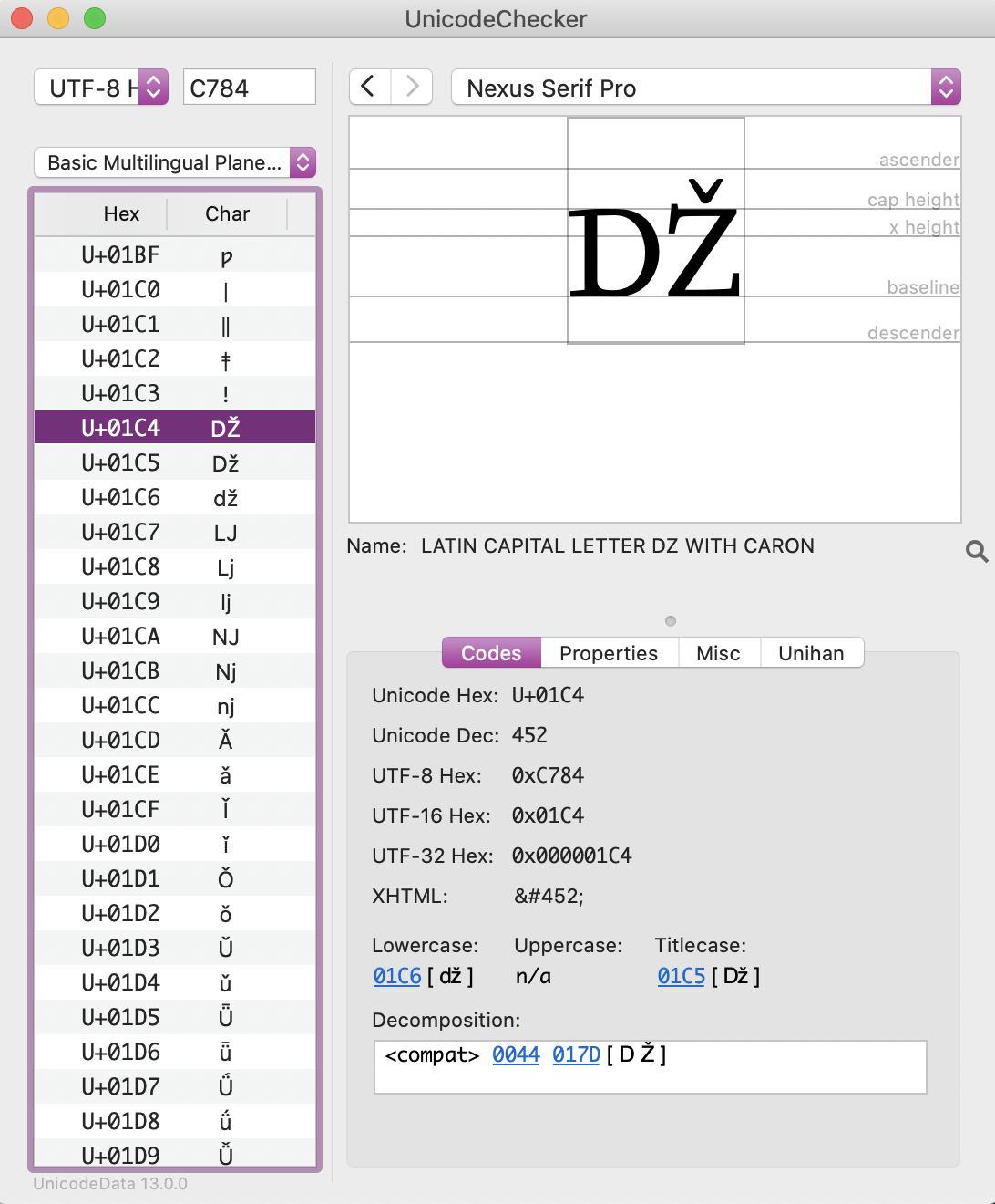
Latin capital DZ with caron
All of these three characters form part of the Latin Extended-B block.
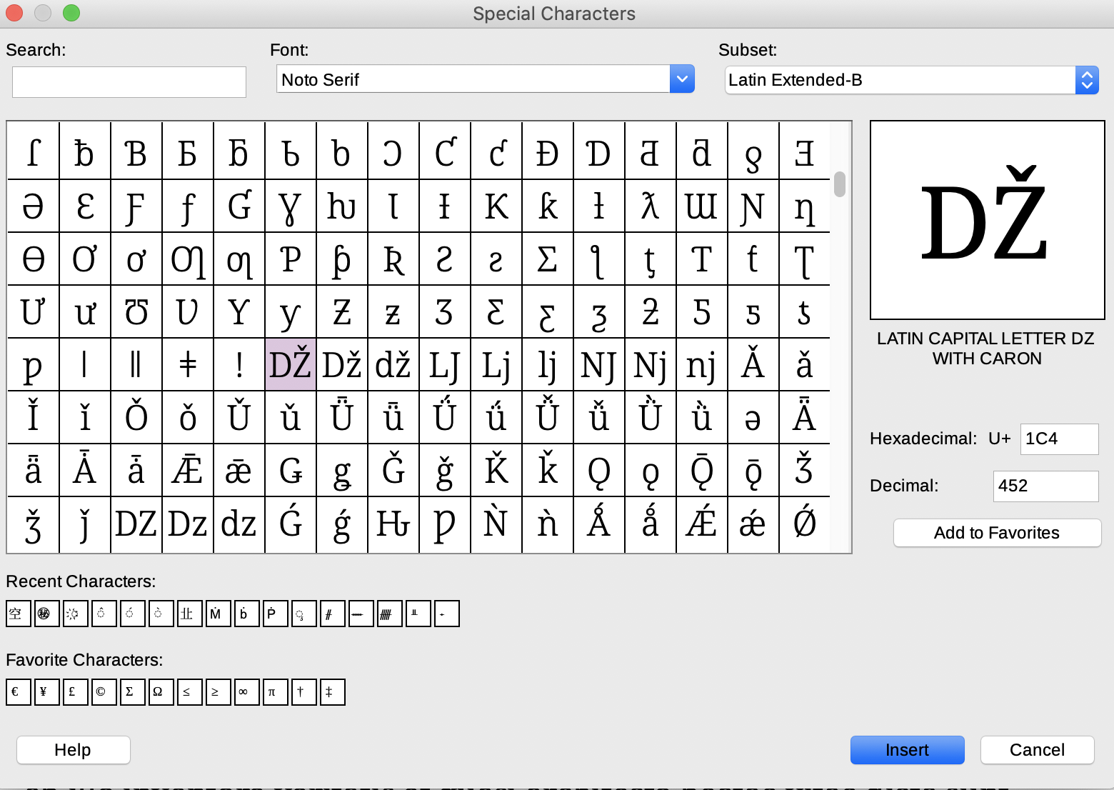
Latin Extended-B in Unicode
See if you can identify them also in the Noto Serif character set.
A ligature is another form of joined character, but with a different purpose.
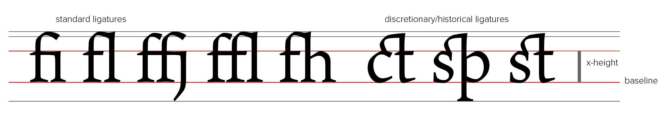
Ligatures
Today, what are termed standard ligatures are joined characters that avert otherwise awkward clashes, e.g. when an i or l follows an f. It is a good idea to activate these ligatures if you notice that clashes do arise in the font that you may be using.
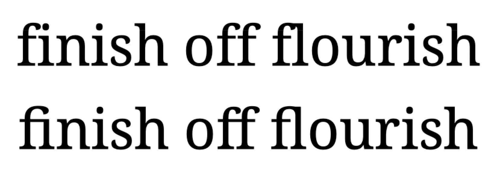
Noto Serif: with and without ligatures
In the case of Noto Serif, f and l are liable to clash, as you can see in the top line.
You can, however, opt for fonts which are designed in such a way as not to require ligatures, like Liberation Serif, which is the default open-source font in Libre Office.
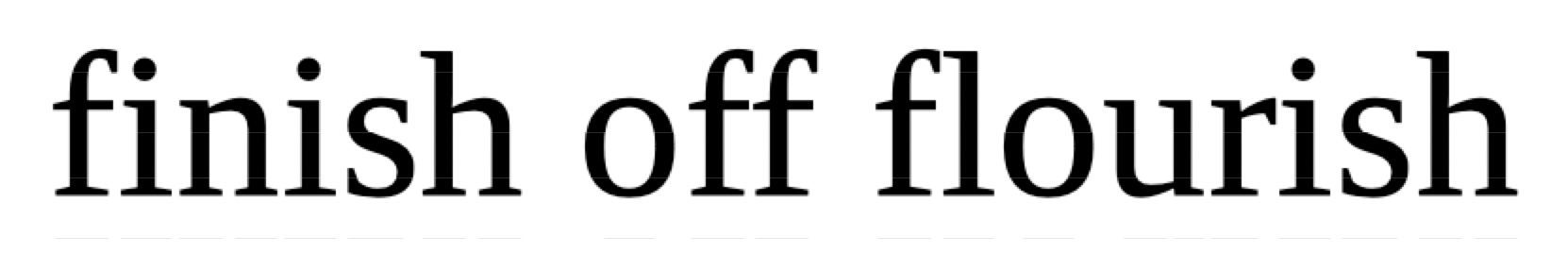
Liberation Serif
OpenType fonts also often include historical or discretionary ligatures, which are mainly ornamental or antiquarian. These should be avoided in your essays: for the reader of today, they are something of a distraction. On the other hand, if you are reproducing the typography of an original source, you may wish to make use of them.
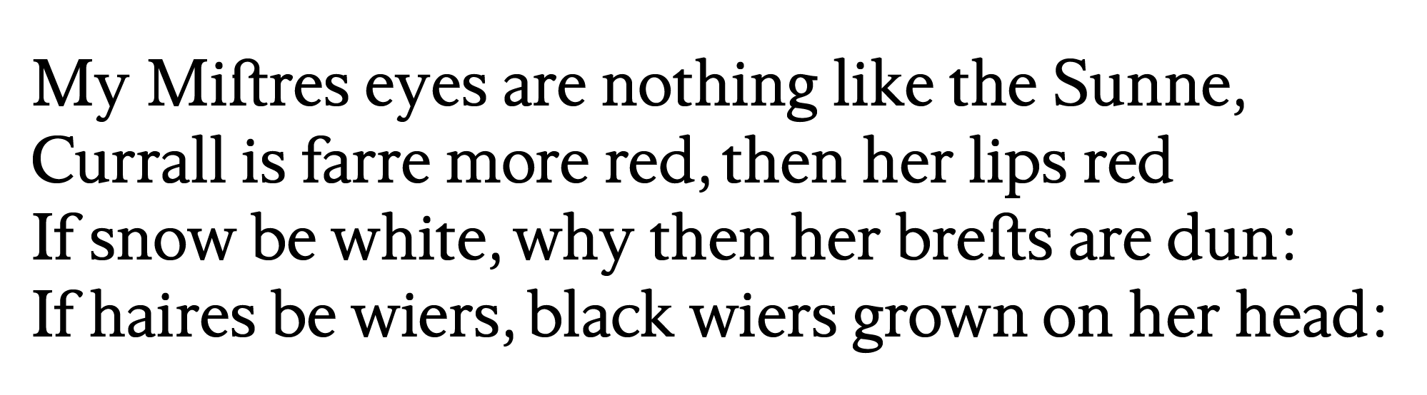
Shakespeare, Sonnet 130: historical st ligature
Numerals
OpenType fonts typically include numerals in different styles:
- old-style (or non-lining) proportional numerals
- old-style tabular numerals
- lining proportional numerals
- lining tabular numerals
Varieties of numerals
Old-style numerals are appropriate to use in body text: they form an even line with alphabetical characters, so improving the legibility of your content. Tabular forms, whether lining or non-lining, are most useful in tables: columns of numbers then remain aligned from row to row. Lining numerals are as a rule slightly less than capital height. Where figures are to be combined with upper case characters, lining numerals are a better choice.
Accessing font features in word-processors
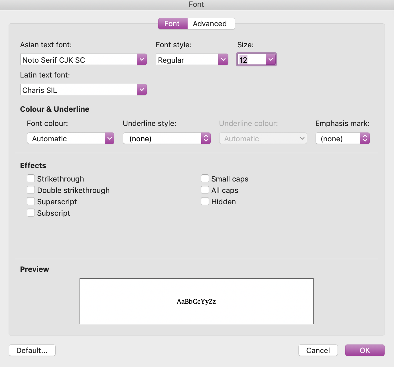
To access font controls in Word, select Format > Fonts, or use to keyboard to select CTRL+D (Windows) or CMD+D (macOS).
Fonts in Word
The basic controls are available in this interface. To access more specialized features, select Advanced.
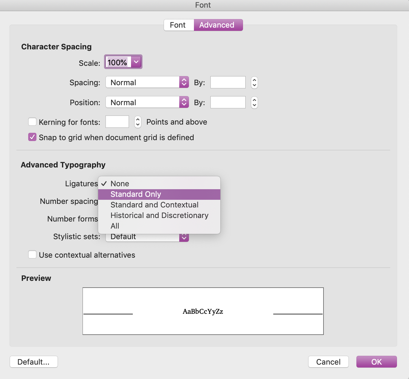
Advanced font options in Word
Here, you can control kerning, where necessary. You can also access OpenType font features, including ligatures.
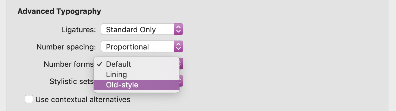
Numerals in Word
Here, proportional and non-lining or old-style numerals are selected.
The best option to control font features in LibreOffice is to use the Typography Toolbar.
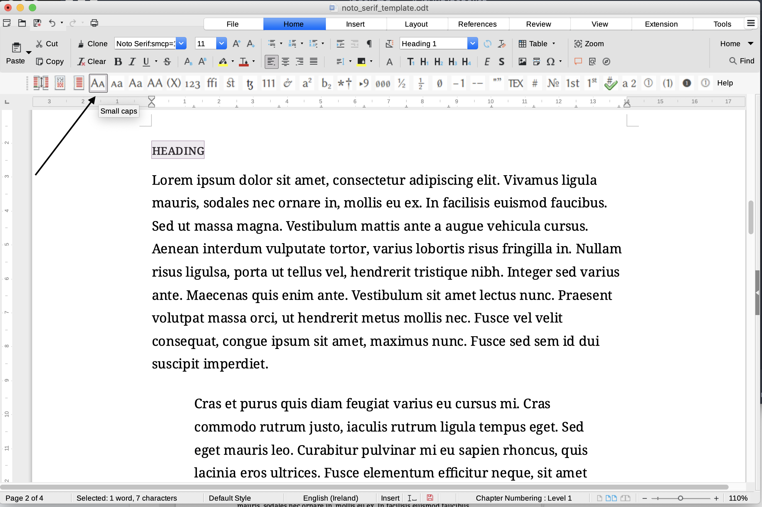
The Typography Toolbar in LibreOffice
Highlight a segment of text, or press CTRL+A or CMD+A to select all of the text in a document, and select the feature that you wish to apply.
2 - Installing fonts
Tip
Both Windows and macOS support TrueType (.ttf) and OpenType (.otf) fonts. Make sure that any fonts you download are in these formats, rather than webfonts.
Unicode fonts
The most practical resource to access scripts encoded in Unicode is the Noto Project. You can browse which fonts you would like to install. Noto Serif includes all of the various Latin blocks in Unicode and much more besides, as you can see from the full character set.
Charis SIL is also a useful font to install. Here is the full character set.
For access to a very wide range of symbols in Unicode, you can turn to the font Symbola.
Historical fonts
It is useful also to install fonts that include historical scripts that may no longer be in use, like Ogham, which is just one of a large number of scripts included in Clara.
Cardo, which describes itself as “is a large Unicode font specifically designed for the needs of classicists, Biblical scholars, medievalists, and linguists”, is also a useful resource.
What a font encompasses
Typically, you will download a font in the form of a zip file. Once you have uncompressed it, you will find the separate files for different typefaces: typically Regular (or Roman), Italic, Bold and Bold Italic.
Other fonts may contain a much larger range of weights.
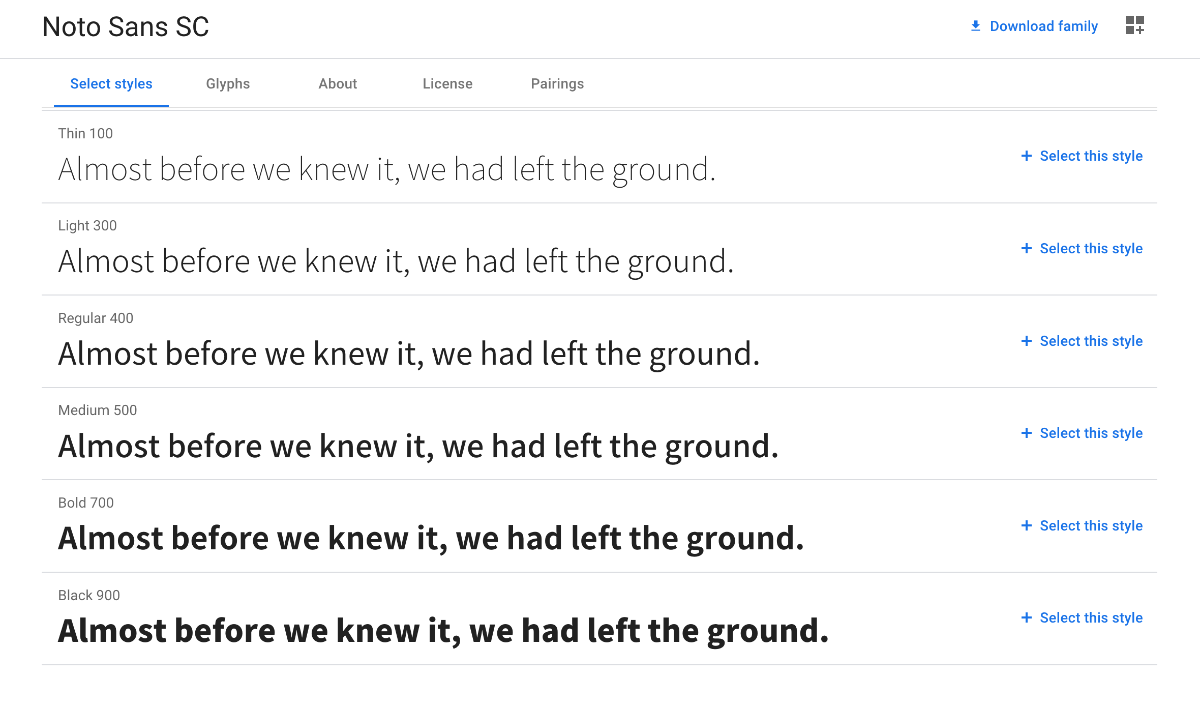
Font weights in Noto Sans Simplified Chinese
You can choose to install all of these or simply the ones that you are most likely to find useful.
Installing fonts in Windows
- Unzip the compressed file containing the fonts.
- Right click on an individual font file and select Install.
- Repeat for further styles and weights.
Installing fonts in macOS
- Unzip the compressed file containing the fonts.
- Double click on an individual font file.
- When Font Book opens, select Install Font. As a rule, all of the styles and weights of the same font will be installed.
3 - Fonts and Unicode
Fonts and scripts
Unicode has led to the development of a range of fonts that encompass not only the major scripts in use in the world today, but also historical and iconographic materials.
CJK fonts
Thus, the Noto CJK Simplified Chinese font provides support for the following major contemporary scripts:
Cyrillic, Han, Hangul, Hiragana, Katakana, Latin, Simplified Han, Traditional Han
This means in turn that it can encode content in the following languages:
Afrikaans, Albanian, Asu, Basque, Bemba, Bena, Bulgarian, Cantonese, Catalan, Chiga, Chinese, Chinese (Simplified), Cornish, Danish, Embu, English, Faroese, Filipino, Friulian, Galician, German, Gusii, Icelandic, Indonesian, Irish, Italian, Japanese, Kabuverdianu, Kalaallisut, Kalenjin, Kamba, Kikuyu, Kinyarwanda, Korean, Low German, Luo, Luxembourgish, Luyia, Machame, Makhuwa-Meetto, Makonde, Malagasy, Malay, Manx, Meru, Morisyen, North Ndebele, Norwegian Bokmål, Norwegian Nynorsk, Nyankole, Oromo, Portuguese, Romansh, Rombo, Rundi, Russian, Rwa, Samburu, Sango, Sangu, Scottish Gaelic, Sena, Shambala, Shona, Soga, Somali, Spanish, Swahili, Swedish, Swiss German, Taita, Teso, Vietnamese, Vunjo, Zulu
The CJK fonts were developed jointly with Adobe and the Source Han typefaces are the equivalent of the Noto versions. Like European serif fonts in particular, the development of Source Han is rooted in calligraphic traditions.
European scripts, ancient and modern
Clara, by contrast, encompasses a range of European scripts, ancient and modern, including Latin and Cyrillic, as well as the medieval Irish script known as Ogham. It can therefore support the following languages:
Afrikaans, Akan, Albanian, Asturian, Asu, Basque, Belarusian, Bemba, Bena, Bosnian, Breton, Bulgarian, Catalan, Central Atlas Tamazight, Chiga, Colognian, Cornish, Croatian, Czech, Danish, Duala, Dutch, Embu, English, Estonian, Ewe, Faroese, Filipino, Finnish, French, Friulian, Fulah, Galician, Ganda, German, Gusii, Hausa, Hawaiian, Hungarian, Icelandic, Inari Sami, Indonesian, Irish, Italian, Jola-Fonyi, Kabuverdianu, Kalaallisut, Kalenjin, Kamba, Kikuyu, Kinyarwanda, Lithuanian, Low German, Lower Sorbian, Luba-Katanga, Luo, Luxembourgish, Luyia, Macedonian, Machame, Makhuwa-Meetto, Makonde, Malagasy, Malay, Maltese, Manx, Meru, Morisyen, Nama, North Ndebele, Northern Sami, Norwegian Bokmål, Norwegian Nynorsk, Nuer, Nyankole, Oromo, Polish, Portuguese, Quechua, Romanian, Romansh, Rombo, Rundi, Russian, Rwa, Samburu, Sango, Sangu, Scottish Gaelic, Sena, Serbian, Shambala, Shona, Slovak, Slovenian, Soga, Somali, Spanish, Swahili, Swedish, Swiss German, Taita, Teso, Tongan, Turkish, Turkmen, Ukrainian, Upper Sorbian, Uzbek, Vunjo, Walser, Western Frisian, Wolof, Zulu
The scope of the font is considerably wider than many of the system fonts installed by default on computers. This makes it a useful choice for your work.
Phonetic transcription
A set of Unicode blocks that is fully supported in the Noto Sans and Serif fonts, Charis SIL and Clara are among those which cover the phonetic script of the International Phonetic Association.
An IPA transcription
You can use a dedicated keyboard where extended inputting in a specialized block is required.
Unicode block by block
Using LibreOffice, you can readily explore Unicode blocks contained in a given font. Consider first the case of Noto Serif. To view the characters encoded in a font, select the omega icon and the select More Characters.
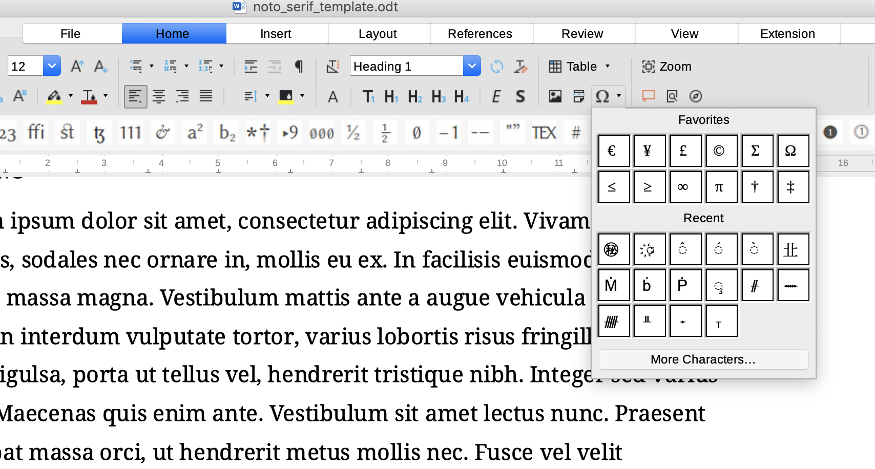
Access to Unicode blocks in LibreOffice
You can then access individual blocks using a drop-down menu.
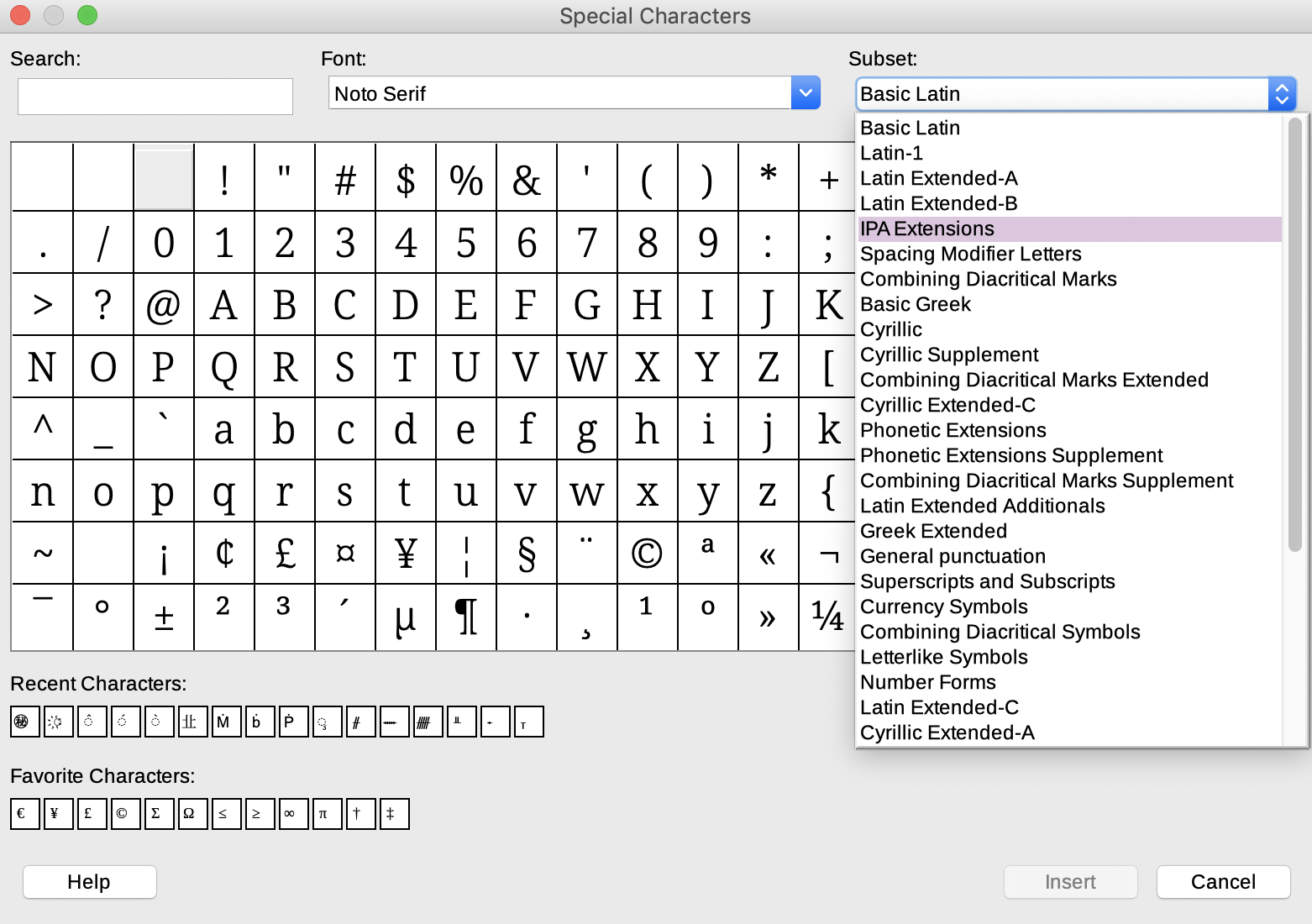
Unicode blocks in Noto Serif
You can then see the characters that are available in a specific block.
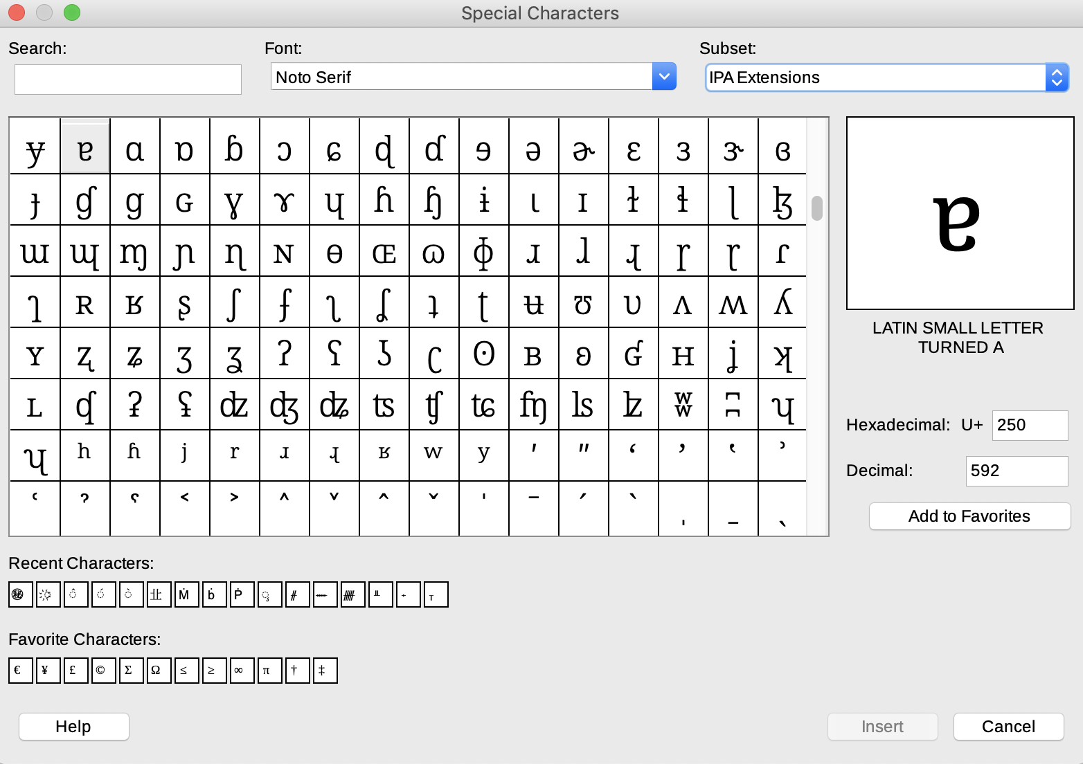
IPA Extensions in Noto Serif
In LibreOffice, you can input characters using this interface, which is a convenient option in isolated cases.
Symbols
Unicode extends also to typographical and many other symbols.
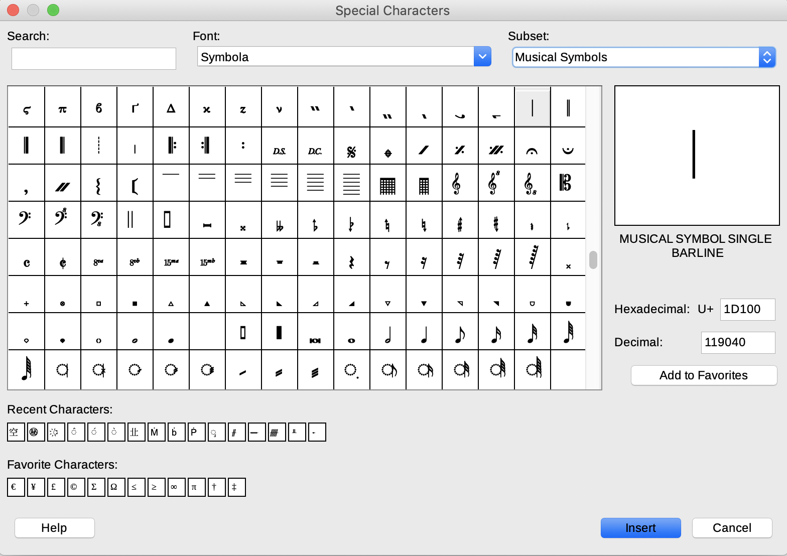
Symbola: musical symbols in Unicode
The font Symbola allows access to multilingual blocks and also to a very wide range of Unicode symbols.
Combining scripts
Dedicated Latin scripts were developed for use with Source Serif and Noto CJK fonts. This means that content in European and Asian languages can easily be combined using the same font.
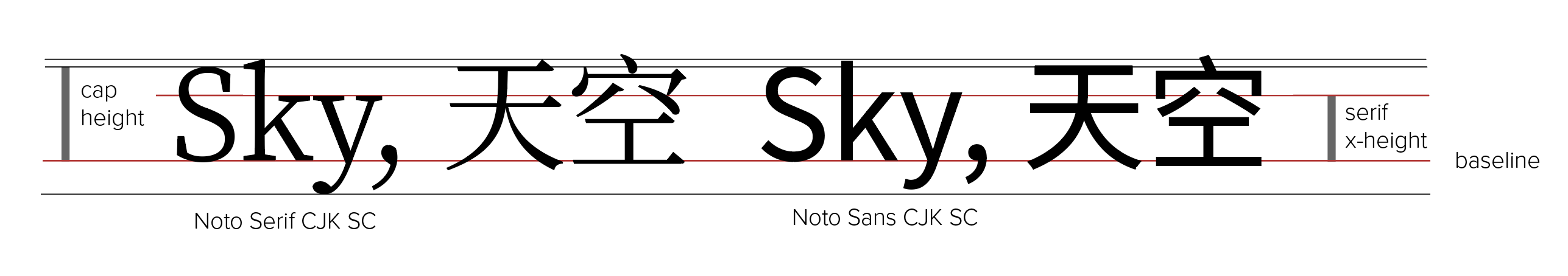
Noto Serif and Sans Serif CJK: Latin and Simplified Chinese
Though Latin and CJK fonts use different baselines and other reference points, they are aligned in such a way as to ensure content in different scripts is integrated.
Latin and CJK scripts in Libre Office
LibreOffice, among other word-processors, now has good support for the display and printing of characters in markedly different scripts.
Similarly, the use of a font like Noto Serif of Charis SIL or Clara makes it possible to combine Latin and IPA scripts, as we can see in the example above.